TO CHEERIO?
I saw the cheerio project as a study of how to dissect a problem. We explored the cheerio's connection to the art elements and to the design principals. Breaking the cheerio down and defining all of these helps us to take good and useful photos with INTENT for current and future problems.The elements explored helped us define each one and now in this problem we take those elements and turn them into themes and interruptions.
These are the ELEMENTS we explored and an description of how I am using these elements in the current problem:
Dot/point and Line: As I take photos I look for compositions that have a focal point that is a dot... also I have used this in contrast to line to create a theme for a system line vs. dot.
shapes: Are created in the compostion/crop of the photo. I have intentionally been taking much more close up photos looking for interesting shapes in the neg/pos spaces.
direction/motion: connects with the line element or theme. The viewers eye can be directed across the composition or be interrupted by the eye being directed off of the composition.
tone: gray scale of shades of gray or the gray scale in color throughout the composition as a theme. We can interrupt the tone of grays with a strong pop of color
scale: up close vs far away can change the size of objects in a photo... also connected to chaos vs. simple in a photo.
dimension: There should be dimension in the composition where some photos pop out towrds the viewer and others receed.
proportions: Keep in mind while grouping pictures that are alike
might have elements in similar proportion ie busy photos group together
or similar proportions of negative space that a group of photos have ...
PRINCIPALS
balance/tension: Can be used to progress a system/theme or the theme could be one ad the other is the interruption.... all the photos could have equilibrium and there are a few well place tensions...
contrast: Is what will make these compositions interesting as well as abstract. Contrast uses most of these elements we explored in the cheerio problem and our new problem is centered around finding and using contrast to create dimension and interest.
emphasis: is made on the interruption which pushes it forward
unity: in the system around a theme/story
figure ground: Is definitely something to keep in mind while we are framing our photos. The negative space is something we should be exploring to create interesting abstract photos that create shapes
similarity/proximity/pattern: Groupings in the composition will share similarities. I have several times separated my photos according to different similarities they share. Patterns can be similar and grouped together... like textures
continuation: Is also an element to think about while taking photos... continuation can connect two photos possibly with line or color. yellow on the edge of one photo can continue on the next photo... lines can connect between a series of photos continuing the line and making it long while directing your eye.
color: Color is much more explored in this problem. Color is constantly being dissected and explored and connected to other colors. This is an on going process and should have a whole blog dedicated to its exploration and the progress of my knowledge about it!
expression: Expression is how these elements are all used. What is our solution expressing with line? dot? color? etc... the overall mood of the viewer and the attention that is keep while viewing is captured with the expression of the elements it creates.
TO CONTRAST PROBLEM?
This seasons problem seems like an extended version of the first problem we did. We spent so much time looking for similarities in photos only to realize we were looking for contrast! The question was how to make the 2 photos of leaves vs linear interesting and more abstract through contrast. I don't know why but it didn't occur to me to take that lesson learned and knowledge into this problem... its the same. We explore the similarities in our photos (of the elements we have studied) in a much bigger fashion and create a system with flow and similarity only to beef in up and make in interesting with contrast again. Its interesting that i didn't pick up on that much sooner.
Sunday, October 7, 2012

Seasons process
Problem Statement: Design 3 sets of a series of 8 photos using 4 seasons as an overall theme. There must be a story, photos are 4x6 in size. First set shall include 2 photos from the first contrast project (side by side in composition); the second set should be composed of any photos existing or new; the third shall be composed of all new photos.


FIRST CRIT:
My first idea (group1): I started out by separating my pictures by colors. I thought a theme could be rainbow. Each picture could progress through the seasons as well as progress through ROYGBV. Reflecting on this theme now and getting more information about the problem since these thoughts I look at this and think that I see a system for sure. There is an order/pattern/rhythm. BUT there is nothing interesting about it. I am glad I explored this theme but I am only seeing the color... I am not looking at the photos themselves and what's in them. When I look at the photos themselves there really isn't an interesting connection because they are all pretty busy/chaotic. These photos need to be simpler and the lines or objects in each should connect. There should be groups of pictures that connect creating a sort of hierarchy and 3 dimensional quality where some pictures are pushed forward and others are pushed back. I feel like there are a few photos in this series that have blue in them and they are the closest there is to having this pop out effect.

While looking at all of my photos as contact size pics I saw a lot of range in gray scale. I explored going from highlights to shadows and I feel like this theme is a bit more successful. There is a system the flows much more connectively than the one above. I find it very difficult to keep this connection while also trying to keep the seasons in order. At this point I have not realized that there should be and INTERRUPTION. I have not seen the connection between this project and our first contrast project. I do think its a VERY important process to create the series as a system first and then explore the contrast or interruption factor. So at this point I am still exploring the ordered system.
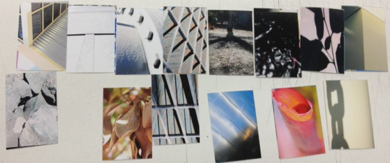
Seeing the highlights and shadows brought forth another theme of metal. There are lots of grays in the photos of metal I have so that also creates a successful system... I am starting to get comfortable at this point and am finding that with this theme there are lots options that look interesting and work well. And I don't know it yet but the pop of orange on the blue metal door works well as an interruption... I will later expand on this idea... grays/blues on the metal will contrast with the pop of orange and how can I tie in the orange in other photos to push the contrast even more as well as create the 3 dimensional effect.

Another metal theme but also a linear theme with the orange pop again. These would be part of group 3. I went out and took pictures specifically expanding the above theme... More exploring of the above ideas.

SECOND CRIT:
At this point the problem has been expanded in my mind which makes me look at it much differently. There should be a system with an interruption! Interruptions create rhythm, groupings, focal points. Contrast can be an interruption. At first I was using the contrast to progress from one end of the spectrum to the other (ie see above highlight to shadow). Now the focus is on turning the contast factor into the interruption rather than the system... possibly use them in both factors?? So going back to the first project we can review some of the many different ways to contrast: light to dark, texture, big to small, chaos to simple, linear to organic etc. (lots more)
I feel these crits are looking MUCH more interesting as I progress.
New theme idea was textures. There is a very obvious theme/system that keeps interest because most of them are rough textures that connect and don't compete untill you pass over the smooth water droplet photo and the hexagonal pattern which interrupt the pattern and pop out. I really like this concept

Here is an expansion of the previous crit with metal and line... I am trying to play more with orange.

Here is another theme for group 1 ... using line vs. dot. the dot is interrupting the system of lines while also playing with warm vs. cold... still a work in progress

Another new theme for group 3.... Playing with metal again as well as highlight to dark but then throwing in the warm color here and there... At this point we are given the freedom to make one of the seasons the interruption itself. In this example I am exploring the fall color orange as the interruption.

I think this is a very beautiful exploration of the line theme. There seem to be many options with my photos for this theme. I created this system after a class discussion of directing the viewers eye off the composition. The red is creating the pop up effect...

Monday, September 24, 2012
Photo Contrasts
PROBLEM STATEMENT: Using gestalt principals take photographs of clusters of leaves and of linear shadows. Each photo should have
contrast, direction, visual interest and a clear point of view. Create a dynamic
system of three groups consisting of two photos each there should be one photo
from both categories. Each pair should share a connectivity different from the
others and can be subtle or obvious.


Sunday, September 23, 2012
Process for Photo Project
PROBLEM STATEMENT: Using gestalt principals take photographs of clusters of leaves and of linear shadows. Each photo should have
contrast, direction, visual interest and a clear point of view. Create a dynamic
system of three groups consisting of two photos each there should be one photo
from both categories. Each pair should share a connectivity different from the
others and can be subtle or obvious.


RESEARCH:
Cluster: A group of the same or similar elements gathered or occurring closely together; a bunch. Synonyms- Bunch, group, collection, band, gathering, constellation, knot, mass, nugget, bundle, crowd.
Linear: of, relating to, resembling, or having a graph that is a line and especially a straight line: involving a single dimension. Characterized by an emphasis on: composed of simply drawn lines with little attempt at pictorial representation of, relating to, or based or depending on sequential development.
Shadow: An area that is not or is only partially irradiated or illuminated because of the interception of radiation by an opaque object between the area and the source of radiation. The rough image cast by an object blocking rays of illumination. The darkness following sunset. A feeling or cause of gloom or unhappiness. A shaded area in a picture or photograph.
Leaves (ORGANIC) vs. Linear (GEOMETRIC)
Cluster: A group of the same or similar elements gathered or occurring closely together; a bunch. Synonyms- Bunch, group, collection, band, gathering, constellation, knot, mass, nugget, bundle, crowd.
Linear: of, relating to, resembling, or having a graph that is a line and especially a straight line: involving a single dimension. Characterized by an emphasis on: composed of simply drawn lines with little attempt at pictorial representation of, relating to, or based or depending on sequential development.
Shadow: An area that is not or is only partially irradiated or illuminated because of the interception of radiation by an opaque object between the area and the source of radiation. The rough image cast by an object blocking rays of illumination. The darkness following sunset. A feeling or cause of gloom or unhappiness. A shaded area in a picture or photograph.
Leaves (ORGANIC) vs. Linear (GEOMETRIC)
- Organic: Of, relating to, or derived from living organisms. Of relating to, derived from, or characteristic of living plants and animals. A work is said to possess an organic form if the work's structure has originated from the materials and subjects used by the author, "as a plant". The organic form, is innate; it shapes as it develops itself from within, and the fullness of its development is one and the same with the perfection of its outward form. An irregular shape, or one that might be found in nature, rather than a regular, mechanical shape. I imagine many colors that naturally transition and flow together as well as contrast. Color can be unpredictable in organic forms.
- Geometric: Of or relating to geometry and its methods and principles. Using simple geometric forms such as circles and squares in design and decoration. Geometric forms are those which correspond to named regular shapes, such as squares, rectangles, circles, cubes, spheres, cones, and other regular forms. Architecture, such as this example by Frank Lloyd Wright, is usually composed of geometric forms. I imagine blacks, greys and whites when I think of linear shadows.
- Connect with similarities: Colors, lines, shapes, lighting, subjects, sizes, direction.
- Connect with contrast: color vs black/white, big vs little, light vs dark, cold vs. warm, close vs. far, horizontal vs. vertical, simple vs. complex, single vs. multiple, whole vs. parts, directional, organic vs geometric, dot vs line, high vs low.
- Quality: High resolution camera with manual setting so that I can control the light, shutter speed etc. Send out to get printed or print on quality paper. Make sure there is enough ink in the printer.
- Size: 4”x6” portrait or landscape.
- Contrast: make sure to display many layers of grey from the whitest white to the darkest black. A good quality black and white photo has a large range of greys.
- Cropping: Think about how to frame the digital shot while taking the picture and fine tune the crop in Photoshop later. Here is where you will also tweak the lighting, color, contrast using curves.
- Time: Manage time and try taking photos at different times of the day. Shoot multiple times to ensure you get the perfect crop and lighted image of the subject.


THIRD CRIT:

Love this combo but there is something that doesn't allow the two pics to connect. There is great contrast but the connectivity is missing.... try the starbucks picture next to the twigs.

There is a strong color contrast but the amount of dark is similar in each photo. Similar use of positive and negative space

These are Okay (much more abstract but they can be pushed... simpler... try a close up of the leaf

This is the strongest contrast and I need to find the right purple

FINAL CHOICES


Saturday, September 22, 2012
MORE color
PROPERTIES:
Value--> The light/darkness of a color (also tone). Knowing value provides the designer another compositional edit.
Saturation--> Intensity or saturation is brightness or dullness of a color. It's the measure of colors purity, brightness or grayness. Saturation is amount of gray in the color. Brightness is amount of WHITE in a color... color little or no saturation contains large amounts of white.

Without even knowing it we are receiving messages to our brain about objects or things we view because of their colors. These messages are very emotional. Color choices can make or break a product or business. Color choices must be well thought out and researched. My research has brought me to this quote: "Colors, like features, follow the changes of the emotions." - Pablo Picasso
Color psychology-->

Value--> The light/darkness of a color (also tone). Knowing value provides the designer another compositional edit.
- Can be used to exaggerate the meaning. When there are changing values, the eye is guided in and around through a visual composition. Distant objects appear lighter in nature which help create an illusion of space and depth.
Saturation--> Intensity or saturation is brightness or dullness of a color. It's the measure of colors purity, brightness or grayness. Saturation is amount of gray in the color. Brightness is amount of WHITE in a color... color little or no saturation contains large amounts of white.
- Desaturated light colors are seen as friendly
- Desaturated dark colors are seen as formal
- Saturated colors are seen as exciting
- Hue is the most ABSOLUTE of the three
- visual energy and variety
- attracts attention
- group disparate elements
- reinforces meaning
- enhances visual composition
- conveys: attitude and emotion
- increases visual interest and can reinforce meaning and organization of elements in any visual composition
- communicates immediately without words
- color association
Without even knowing it we are receiving messages to our brain about objects or things we view because of their colors. These messages are very emotional. Color choices can make or break a product or business. Color choices must be well thought out and researched. My research has brought me to this quote: "Colors, like features, follow the changes of the emotions." - Pablo Picasso
Color psychology-->
- "Color is a powerful communication tool and can be used to signal action, influence mood, and cause physiological reactions. Certain colors can raise blood pressure, increase metabolism, or cause eyestrain." - about.com
- Colors in the red area of the color spectrum are known as warm colors and include red, orange and yellow. These warm colors evoke emotions ranging from feelings of warmth and comfort to feelings of anger and hostility. - about.com
- Colors on the blue side of the spectrum are known as cool colors and include blue, purple and green. These colors are often described as calm, but can also call to mind feelings of sadness or indifference.
- Chromotherapy is sometimes referred to as light therapy or colourology and is still used today as a holistic or alternative treatment. - about.com
- Red was used to stimulate the body and mind and to increase circulation.
- Yellow was thought to stimulate the nerves and purify the body.
- Orange was used to heal the lungs and to increase energy levels.
- Blue was believed to soothe illnesses and treat pain.
- Indigo shades were thought to alleviate skin problems.

Wednesday, September 12, 2012
Color Schmuhler
“The hardest thing to see is what is right in front of you.
It’s not what you look at that matters, its what you see." Define isolate edit
Anytime
I have created art I have been very vocal about my fear of color. Fear in this
case is felt because I don’t have the knowledge of something and experience to
push through learning about it. I am great with gray scale, I can work with
that. From what Gwen has said in class color can be thought of as in grayscale.
There are highlights, mid-tones and darks. Maybe I can mesh this and just SEE
it instead of looking for the answer. I
have a desire to KNOW and SEE color for what it is… colors are pieces to
puzzles. You would think that since we all see in color and identify objects we
see partially because of the colors that they are, we would be more familiar
with color. I understand the basics; I get that blue and yellow make green and
red and blue make violet. But when I was in class trying to SEE what was in my
photos I felt handicapped. I do NOT understand that red-brown has green in
it??? I suppose because green is complementary to red that it neutralizes it to
brown. I feel like I need to write this out on a blackboard a hundred times and
to put it on a recorder on my i-phone to burn it into my brain...
In class, I was trying to see a different way by DEFINING one color and fluting it with other color I thought were in that color… I would EDIT them and I was confusing myself by making it harder than it was. I ISOLATE one color and try “fluting” it and then I forget about the picture and end up with a “pretty” color palette that I like a lot but then it doesn’t match the photo. Gwen comes over and immediately chooses the obvious colors in the photos and I can SEE the color as she is choosing them. I want to learn how to make it that easy… to know that the colors I choose from the photo will relate and be in each other. The hardest thing to do is to retrain my brain. I really, really want it and I will keep trying.
Monday, September 10, 2012
Not just a snapshot...
"A picture is worth 1000 words"
Define:
- Refers to the notion that a complex idea can be conveyed with just a single still image. It also aptly characterizes one of the main goals of namely making it possible to absorb large amounts of data quickly.
- A picture tells a story just as well as a large amount of descriptive text.
History:
- The expression "Use a picture. It's worth a thousand words." appears in a 1911 newspaper article quoting newspaper editor discussing journalism and publicity.
- This phrase emerged in the USA in the early part of the 20th century. Its introduction is widely attributed to Frederick R. Barnard, who published a piece commending the effectiveness of graphics in advertising with the title "One look is worth a thousand words", in Printer's Ink, December 1921. Barnard claimed the phrase's source to be oriental by adding "so said a famous Japanese philosopher, and he was right". Many things had been thought to be 'worth ten thousand words' well before pictures got in on the act; for example:
- "One timely deed is worth ten thousand words" - The Works of Mr. James Thomson, 1802.
- "That tear, good girl, is worth, ten thousand words" - The Trust: A Comedy, in Five Acts, 1808.
- "One fact well understood by observation, and well guided development, is worth a thousand times more than a thousand words" - The American Journal of Education, 1858
- It began to be used quite frequently in the US press from around the 1920s onward. The earliest example I can find is from the text of an instructional talk given by the newspaper editor Arthur Brisbane to the Syracuse Advertising Men's Club, in March 1911: "Use a picture. It's worth a thousand words."
My
thoughts: There is an endless amount of meaning behind a picture. There are too
many different points of view for a photograph to be locked down with one
specific meaning to be put behind it. A photographer might have every intention
of sending a very specific message to an audience but the message received is
going to be perceived even slightly different than their intention. Some viewers
might like/love a picture and not know why, others may be educated in what to
look for and understand the qualities that are there which they admire.
- Pictures illustrate:
- Stories: There could be a story behind the photograph...a history, for example a family photo would convey that moment in time for future generations. Or a story could be portrayed in a photograph of a news story with an accompanying article. "Such shots need to have something in them that grabs the attention of a viewer. They also will usually have visual and/or narrative focal points that lead the viewer into the photo. Short Stories photos are often shots that leave the viewer of the photograph wondering about what they are looking at – not because they don’t understand it but because they intrigue and leave people imagining what is going on behind the image and what other future images of the scene might look like. In a sense these single image stories are often just as powerful because of what they don’t include in the shot as to what they do include." - http://digital-photography-school.com


- Thoughts: Of the photographer who took the photo and of the viewer who brings their own preconceived ideas, and experiences to the viewing experience. Everyone who views it will experience something different based upon their experiences and what they bring.


- Feelings: The photo could give off strong emotional vibes and create many different reactions. A photo of a sunset would most likely make the viewer feel calm and peaceful whereas a photograph of a starving child would make the viewer feel very conflicted, sad, helpless etc.
Subscribe to:
Posts (Atom)