Problem Statement: Design 3 sets of a series of 8 photos using 4 seasons as an overall theme. There must be a story, photos are 4x6 in size. First set shall include 2 photos from the first contrast project (side by side in composition); the second set should be composed of any photos existing or new; the third shall be composed of all new photos.


FIRST CRIT:
My first idea (group1): I started out by separating my pictures by colors. I thought a theme could be rainbow. Each picture could progress through the seasons as well as progress through ROYGBV. Reflecting on this theme now and getting more information about the problem since these thoughts I look at this and think that I see a system for sure. There is an order/pattern/rhythm. BUT there is nothing interesting about it. I am glad I explored this theme but I am only seeing the color... I am not looking at the photos themselves and what's in them. When I look at the photos themselves there really isn't an interesting connection because they are all pretty busy/chaotic. These photos need to be simpler and the lines or objects in each should connect. There should be groups of pictures that connect creating a sort of hierarchy and 3 dimensional quality where some pictures are pushed forward and others are pushed back. I feel like there are a few photos in this series that have blue in them and they are the closest there is to having this pop out effect.

While looking at all of my photos as contact size pics I saw a lot of range in gray scale. I explored going from highlights to shadows and I feel like this theme is a bit more successful. There is a system the flows much more connectively than the one above. I find it very difficult to keep this connection while also trying to keep the seasons in order. At this point I have not realized that there should be and INTERRUPTION. I have not seen the connection between this project and our first contrast project. I do think its a VERY important process to create the series as a system first and then explore the contrast or interruption factor. So at this point I am still exploring the ordered system.
Seeing the highlights and shadows brought forth another theme of metal. There are lots of grays in the photos of metal I have so that also creates a successful system... I am starting to get comfortable at this point and am finding that with this theme there are lots options that look interesting and work well. And I don't know it yet but the pop of orange on the blue metal door works well as an interruption... I will later expand on this idea... grays/blues on the metal will contrast with the pop of orange and how can I tie in the orange in other photos to push the contrast even more as well as create the 3 dimensional effect.

Another metal theme but also a linear theme with the orange pop again. These would be part of group 3. I went out and took pictures specifically expanding the above theme... More exploring of the above ideas.

SECOND CRIT:
At this point the problem has been expanded in my mind which makes me look at it much differently. There should be a system with an interruption! Interruptions create rhythm, groupings, focal points. Contrast can be an interruption. At first I was using the contrast to progress from one end of the spectrum to the other (ie see above highlight to shadow). Now the focus is on turning the contast factor into the interruption rather than the system... possibly use them in both factors?? So going back to the first project we can review some of the many different ways to contrast: light to dark, texture, big to small, chaos to simple, linear to organic etc. (lots more)
I feel these crits are looking MUCH more interesting as I progress.
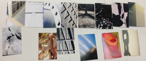
New theme idea was textures. There is a very obvious theme/system that keeps interest because most of them are rough textures that connect and don't compete untill you pass over the smooth water droplet photo and the hexagonal pattern which interrupt the pattern and pop out. I really like this concept

Here is an expansion of the previous crit with metal and line... I am trying to play more with orange.

Here is another theme for group 1 ... using line vs. dot. the dot is interrupting the system of lines while also playing with warm vs. cold... still a work in progress

Another new theme for group 3.... Playing with metal again as well as highlight to dark but then throwing in the warm color here and there... At this point we are given the freedom to make one of the seasons the interruption itself. In this example I am exploring the fall color orange as the interruption.

I think this is a very beautiful exploration of the line theme. There seem to be many options with my photos for this theme. I created this system after a class discussion of directing the viewers eye off the composition. The red is creating the pop up effect...

No comments:
Post a Comment